Building brands that mean something.
In my mind, great branding is so much more than just making things look nice. Great branding, to me, is the foundation on which everything else is built. My approach starts with understanding who a brand is for, what it stands for, and what story it needs to tell. From there, strategy and aesthetics work together: I create a clear visual identity, a distinct voice, and a system that scales across every touchpoint — everything from a campaign hero image to an Instagram caption.
CASE STUDY 01
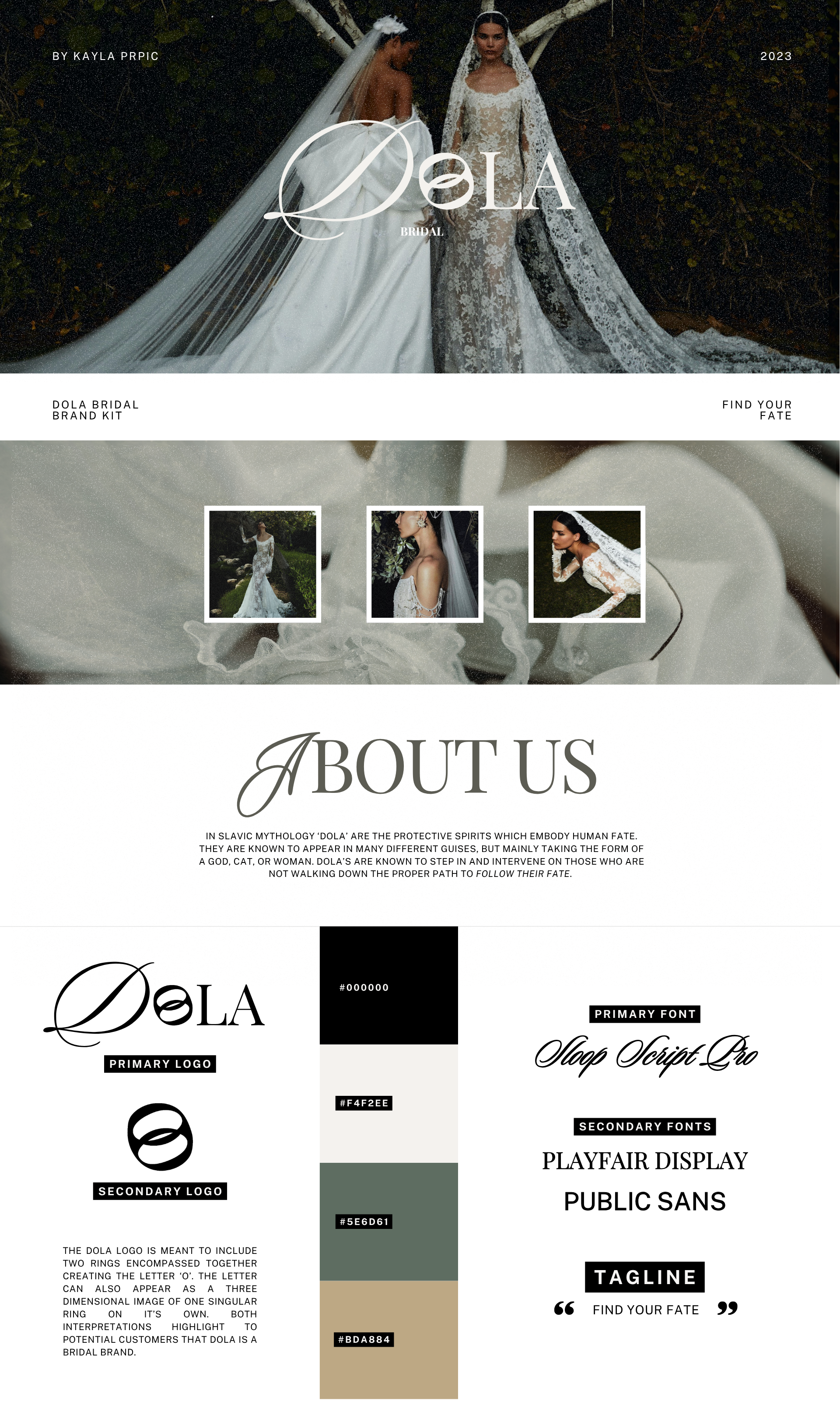
Dola Bridal
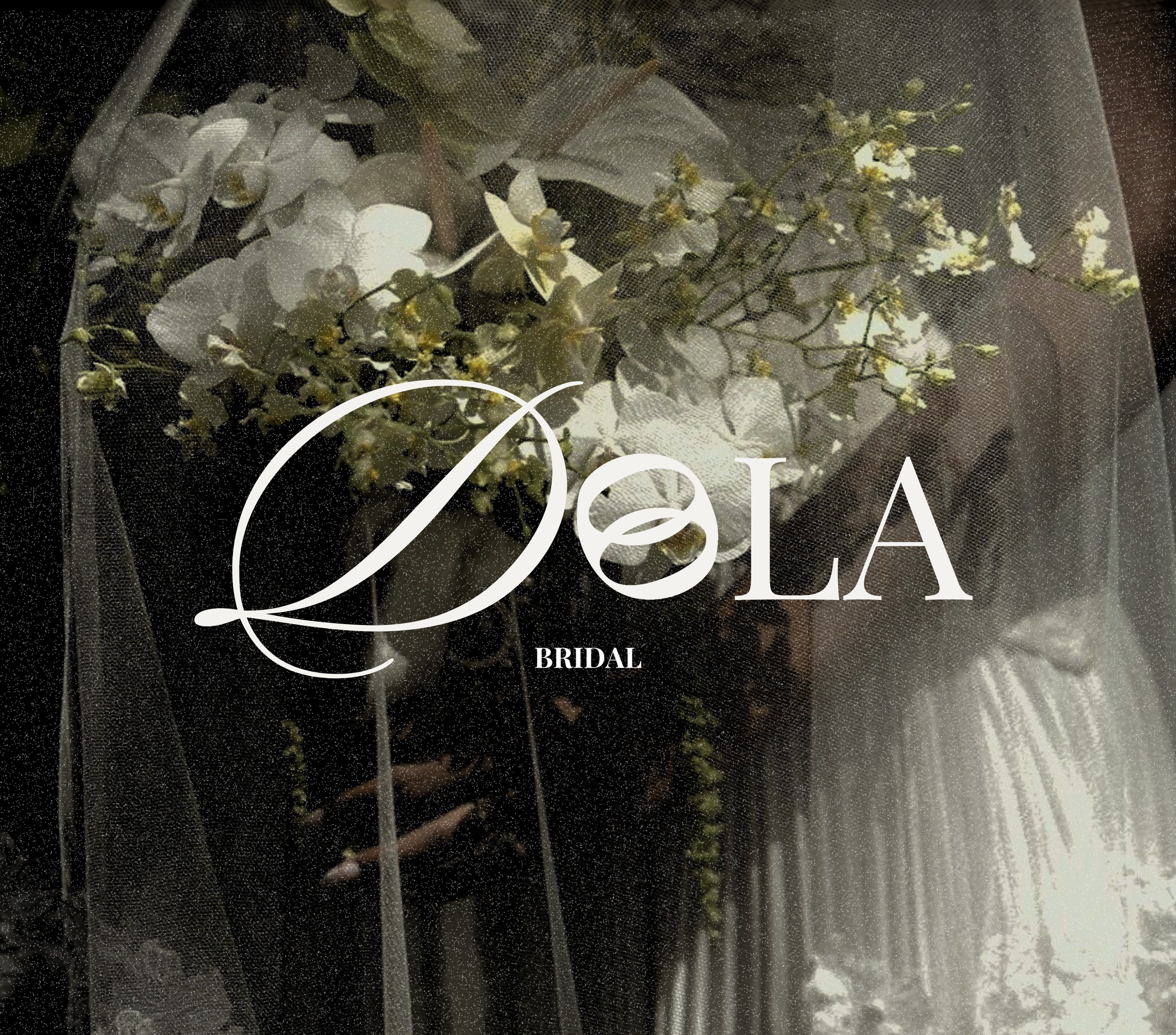
Concept brand — developed as a capstone project to explore positioning strategy in a saturated luxury market.
Dola Bridal was built as a capstone exploration of one core strategic question: how do you carve out genuine differentiation in a market where "luxury" has become meaningless? The answer wasn't a better logo, but a more defensible story. Starting from brand foundation and working outward to visual identity, campaign creative, and content system, every decision was made in service of a single mythology-driven positioning: Find Your Fate.
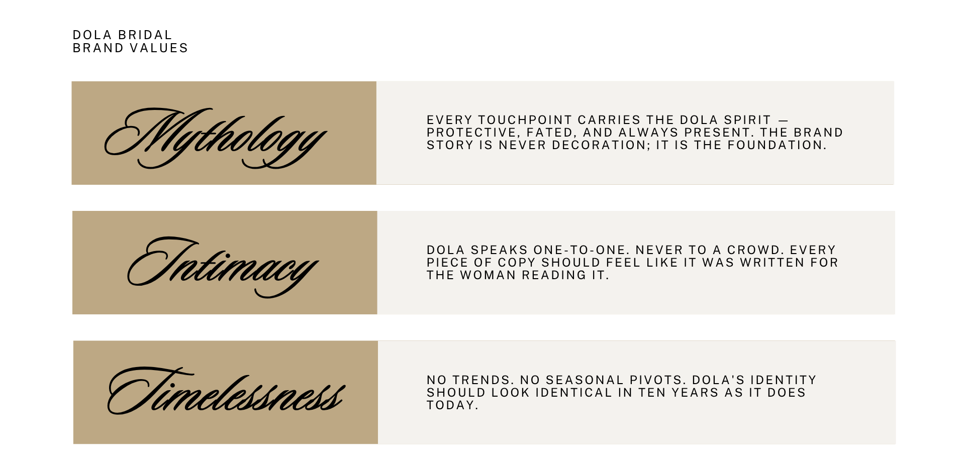
Brand Foundation
The brand takes its name and soul from Slavic mythology: Dola are protective spirits that embody human fate, appearing in many forms to guide those who've lost their way. For a bridal brand, the metaphor is visceral and real: the idea that your wedding day is a moment when everything falls into place, guided by something bigger than yourself. This gave the brand a perfect tagline of Find Your Fate.
find your fate
⋆
find your fate ⋆
Visual Identity
The primary logo features two interlocking rings — doubling as the letter 'O' and a three-dimensional single ring. A quiet symbol of union, designed to be read both ways.
Typography pairs Sloop Script Pro (primary — flowing, handwritten, romantic) with Playfair Display and Public Sans for hierarchy and legibility.
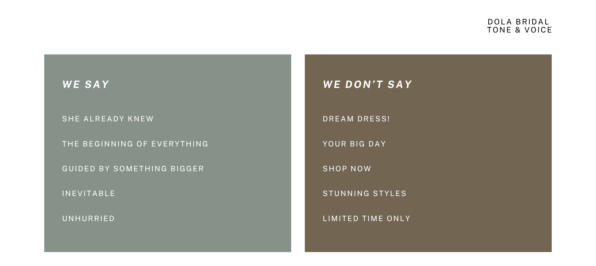
Tone of Voice
Intimate, unhurried, and a little ethereal. Dola isn’t about selling dresses, it’s about introducing you to a whole new feeling.
Evocative over literal — show the emotion, not the product spec
Quiet confidence — no exclamation marks, no urgency tactics
Mythology as metaphor — threads through all campaign copy
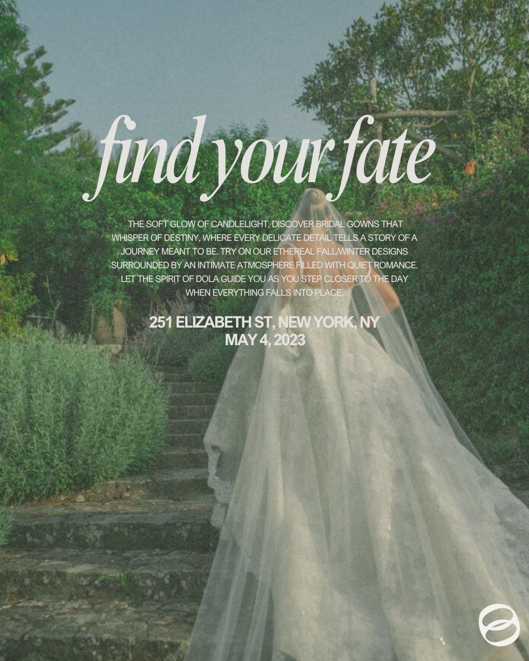
Campaign Creative — "Find Your Fate" F/W Launch
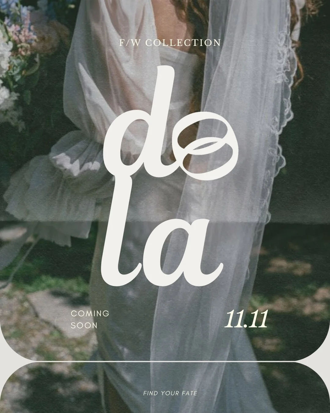
The F/W 2023 collection launch campaign extended the mythology framework into a full content system: pictured is the teaser ad announcing the F/W collection drop, a hero campaign poster for the in-store event at 251 Elizabeth St, and social assets built to feel editorial rather than promotional.
Branding Kit
Every element of the Dola brand system was built to travel. The logo reads two ways at any scale, the colour palette works editorially and commercially, and the typography hierarchy holds in all possible shapes and forms.
The tagline Find Your Fate threads through copy, event creative, and product launches without feeling forced at any point.
My goal with Dola was to build something so internally consistent that each new touchpoint feels like it was almost inevitable to the buyer.
CASE STUDY 02
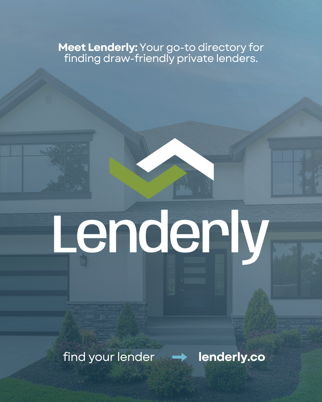
Lenderly
Lenderly is a borrower-first lender directory for real estate investors established in 2026. The platform allows fix-and-flip operators, ground-up builders, BRRR investors, and bridge borrowers to search, compare, and connect with vetted private lenders before they're under pressure on a deal.
The Challenge: The majority of real estate investors are skeptical by default, and lenders are protective of their deal flow. The brand needed to win borrower trust, attract quality lenders, and generate organic traffic — all simultaneously, with no brand equity to start from.
Brand Foundation
The mission was to make private lending transparent, accessible, and borrower-friendly; give real estate investors the tools to find the right lender before they're under pressure; and provide the knowledge to evaluate them properly.
Transparency ● Speed ● Education
Tone of Voice
Lenderly's audience is made up of people who've worked with bad lenders, gotten burned on draws, and learned the industry the hard way. They're not looking for enthusiasm. They're looking for someone who gets it. Lenderly's voice reflects that — direct, knowledgeable, and always on the borrower's side.
Design direction & brand system
Lenderly's visual identity sits at the intersection of real estate investing and fintech. The aesthetic references modern consumer finance brands — Monzo, Chime, Starling Bank — while staying grounded enough to earn trust with experienced investors who've been burned by slick-looking lenders before.
"Before you close" — launch campaign
A four-week phased launch anchored in a single idea: most borrowers pick a lender too late, under pressure, without the right information. Lenderly exists before the deal pressure starts.
-
Introduce the idea that most investors don't think about draw speed until it's already costing them. This does not involve a product pitch; just framing the pain.
-
Explain what a draw rating means and why Platinum is not the same as Silver. Use content from our Real Estate Investor Mentor influencers to carry the explanation through a trusted voice.
-
Show the product, show real lender profiles, and let the directory speak for itself.
-
Launch "Lender of the Week" series and begin building the community loop that keeps borrowers coming back.
Outcome
The Lenderly brand system was delivered in full ahead of platform launch, covering visual identity, tone of voice guidelines, and a four-week phased go-to-market campaign. The "Before You Close" campaign framework was designed for organic scalability, with an influencer-led education layer built to generate trust before any product pitch. Brand architecture and messaging continue to anchor the platform's content and outbound strategy.
CASE STUDY 03
Red Mesa
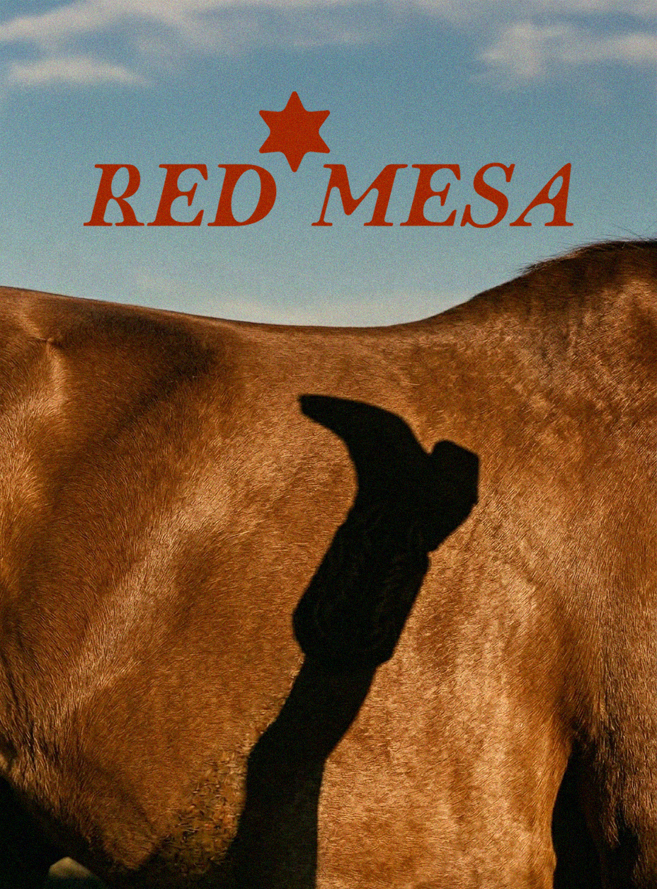
Concept brand — a strategic and creative exploration of repositioning a culturally loaded product category for a modern audience.
Red Mesa was concocted out of this frustration: cowboy boots had been owned by costume and the clichés of country for too long. The women who really wore them, not ironically, and not for a music festival, deserved a boot made for them, with craft, backbone, and beauty in equal parts.
Red Mesa is rooted in the American Southwest but fluent in the language of modern fashion. Think something along the lines of ‘From the Rodeo to the Runway’. These boots will never be a trend piece or fashion statement; they’re supposed to be an inheritance from every woman who ever walked into a room and essentially changed its temperature simply by being there.
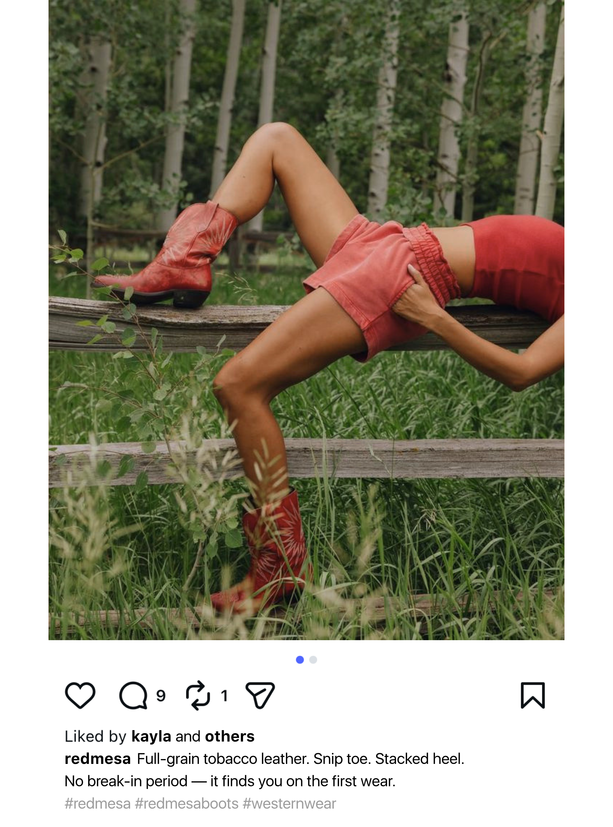
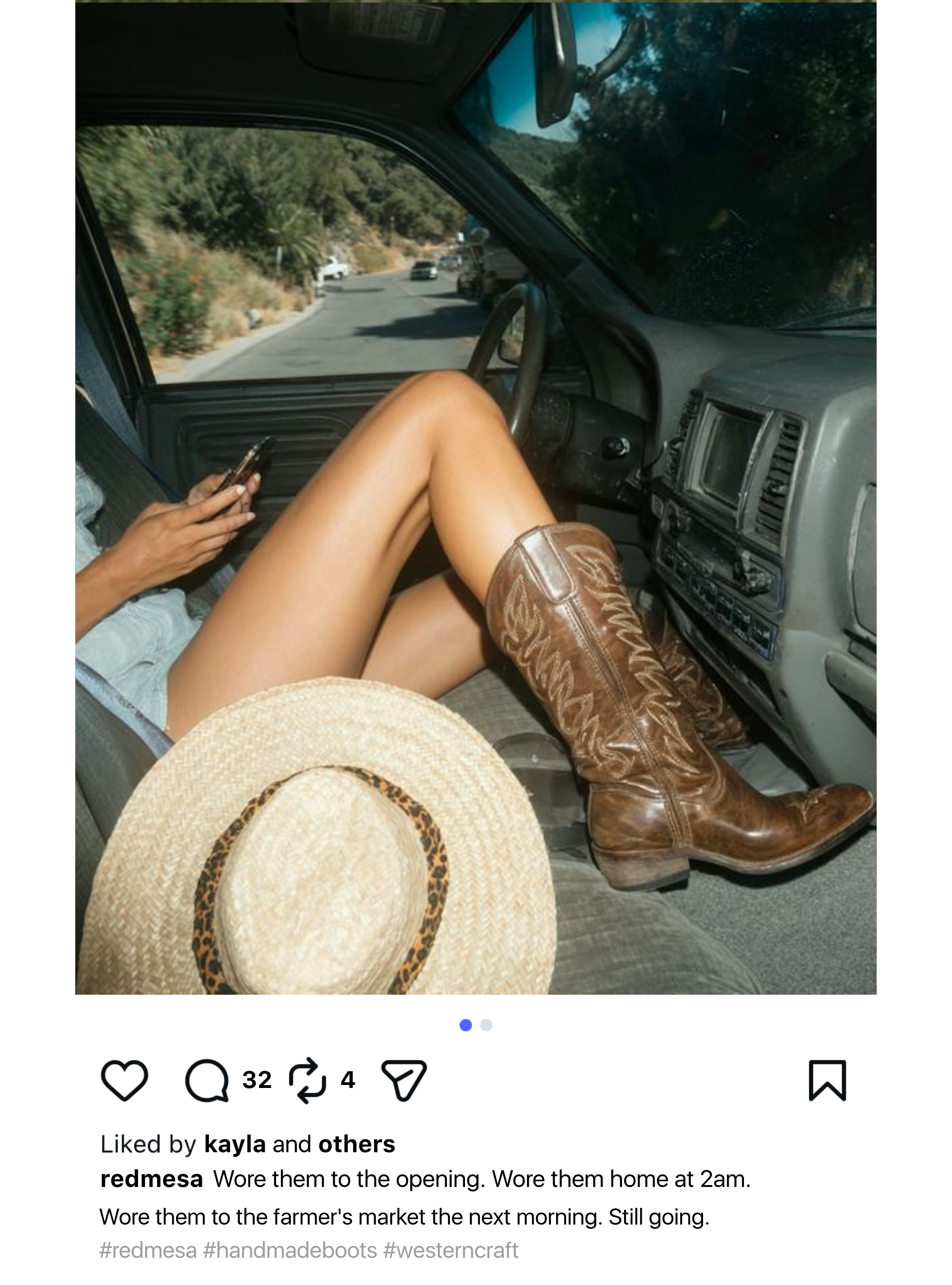
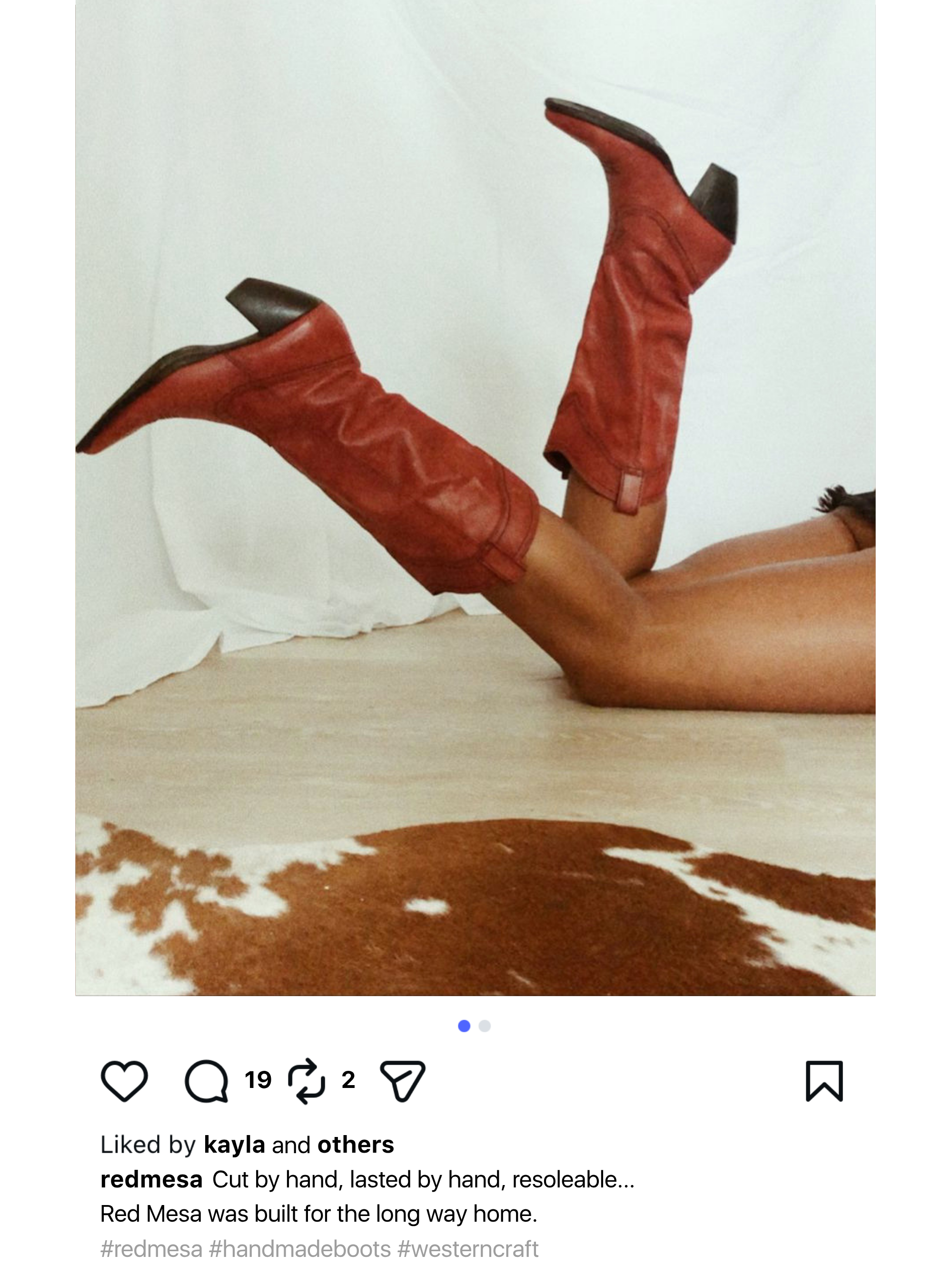
Red Mesa is a positioning exercise as much as a design one. The strategic challenge was real: cowboy boots carry decades of costume-culture baggage that alienates the exact woman who's been wearing them authentically her whole life. The brand strategy strips away the irony and the festival aesthetic, replacing them with something more durable: craft, heritage, and a woman who doesn't need a trend to tell her what to wear. Every visual and copy decision flows from that premise.